The ENS App is a new way of interacting with ENS, designed by removing complexity and focusing on the core actions users actually need. By reducing the need for prior context and tools, it makes claiming and using an ENS name feel more intuitive while still preserving the full power of the underlying system.
When we started building the ENS App, one realization came up again and again: The hardest part was not deciding what to include, but deciding what to leave out.
ENS today is capable of far more than it was a few years ago. It can represent identity across chains, connect to applications, store records, and act as a coordination point for an increasingly complex ecosystem. But as that capability has expanded, so has the surface area that users are expected to navigate.
For a long time, that complexity showed up directly in the interface. If ENS could do something, the product would try to expose it. Over time, that created an experience that was powerful, but not always intuitive.
The App is the result of stepping back from that approach and asking a more fundamental question: What should people actually have to think about?
This is the first time ENS has worked in this direction. Rather than the product adapting to the protocol, the protocol is now being shaped by the product.
To understand the App, it helps to understand what changed behind the scenes.
Historically, ENS products followed a familiar pattern. The protocol would evolve first, new capabilities would be introduced, and the interface would expand to reflect those capabilities. That approach made sense early on, but over time it led to a growing surface area of features, controls, and edge cases that users had to navigate.
The App represents a shift away from that model.
Instead of starting from what the protocol can do, the team started with what users actually need. What are the core actions people come to ENS for? What should feel immediate and obvious? What can happen without requiring the user to manage it directly?
Once those answers became clear, they began to shape not just the interface, but the underlying system itself. Registration flows, pricing logic, and how actions are executed were all influenced by the goal of making ENS feel straightforward at the point of use.
That shift leads directly to the core idea behind the App, which is designing through subtraction. This is not about hiding functionality or reducing what ENS can do, but about making deliberate decisions about what belongs in the primary interface and what does not. The goal is to shape an experience where the most important actions feel obvious, without requiring users to navigate the full depth of the system every time they interact with it.
At its core, the App is meant to serve as the canonical onboarding experience to ENS. Everything is evaluated through that lens.
Some things are automated so the user does not have to think about them. Some things are abstracted so they do not interrupt the flow. And some things are moved elsewhere entirely.
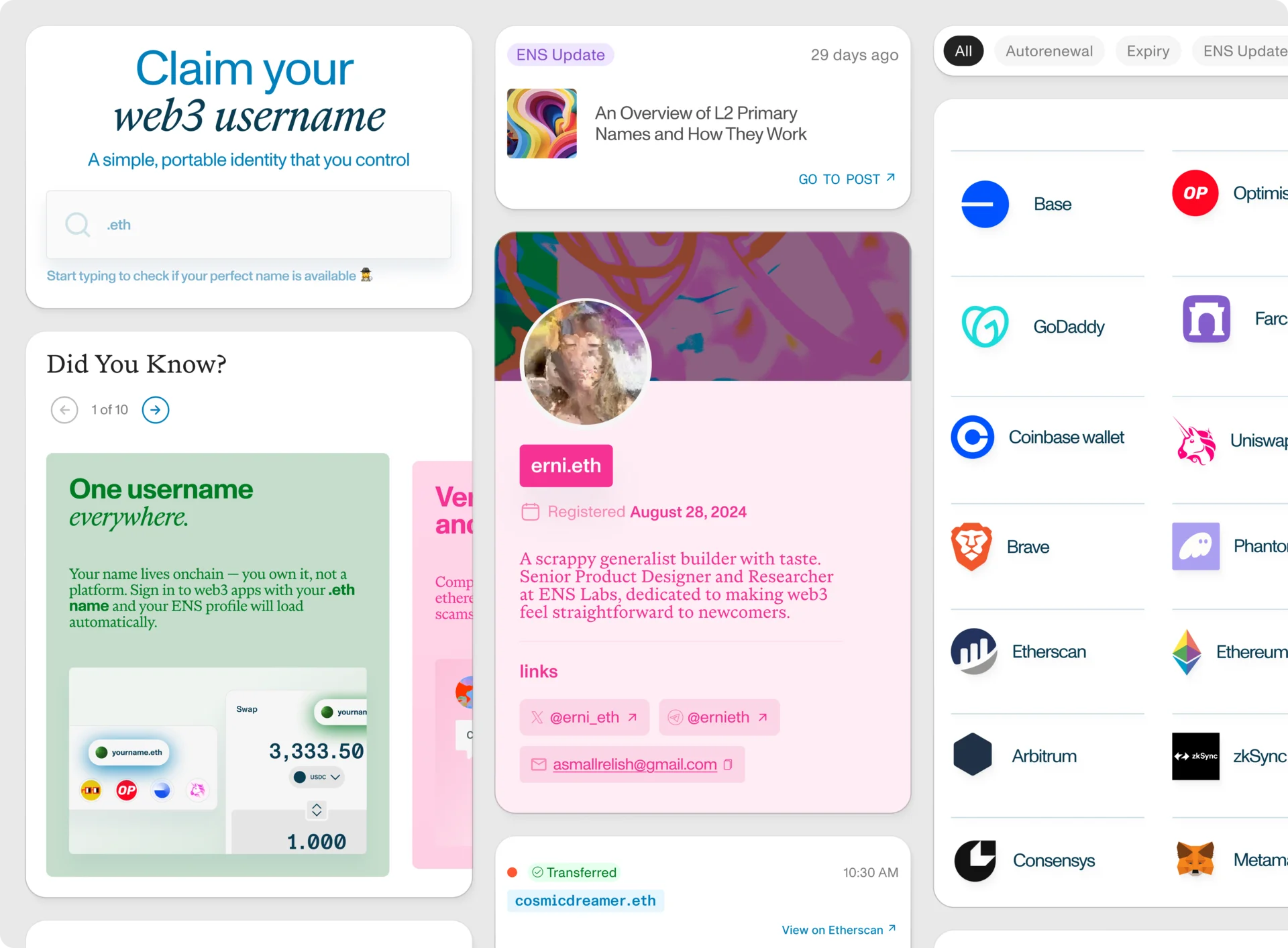
A clear example of this is how ownership and permissions are represented.
In the Explorer, roles are granular and expressive. Different permissions exist for different parts of a name's configuration, which is exactly what builders and advanced users need.
In the App, that complexity is intentionally simplified. You either own a name, or you manage it. That distinction is enough to give most users a clear understanding of their relationship to a name without requiring them to interpret a full permission model.
Rather than trying to collapse everything into a single interface, ENS separates concerns. The App focuses on clarity and usability, while the Explorer remains the place for depth and precision.
One of the most visible outcomes of this approach is the new registration flow.
Previously, registering an ENS name required users to move through a sequence of steps. Each step had its own logic, its own timing, and its own expectations. While the process was reliable, it required users to understand how it worked in order to complete it.
The App rethinks this entirely.
Today, registering a name feels like a single action. You choose a name, confirm, and the system handles the rest. Underneath, multiple steps are still being executed, including bridging funds if needed, committing and revealing the name, deploying a smart contract account, and setting the primary name. These actions are bundled and carried out in sequence, but the user is no longer responsible for managing each one individually.
What has changed is that the user is no longer responsible for managing those steps.
Instead, the App orchestrates the entire process and surfaces just enough information to keep the user informed. Users might see updates about what is happening in the background, but they're not required to intervene or make decisions along the way.
This changes the mental model of registration.
It is no longer a process that users perform step by step. It becomes a system that responds to intent and handles execution on their behalf.
While the registration flow is the most visible improvement, it is not the only one that reflects this shift.
A common way to think about product improvements is in terms of reducing friction. Fewer steps, cleaner interfaces, faster execution. All of that matters, but it does not fully capture the problem.
In many cases, especially in web3, the bigger challenge is not friction but context and tools. Before someone can even begin, they often need to understand how wallets work, hold the right assets, be on the correct network, and have a mental model of what is happening behind the scenes. For users coming from web2, this is unfamiliar territory. Most web2 products rely on a much simpler baseline, where a user only needs an email, a password, and a way to pay.
The App is designed to sit between these two worlds and make the unfamiliar feel more intuitive. Instead of expecting users to arrive with the right setup and knowledge, it reduces the amount of context they need to have upfront and removes the dependency on specific tools wherever possible. The goal is not to abstract web3 entirely, but to make interacting with it feel closer to the patterns people already understand.
This shows up most clearly in how people get started.
Users no longer need to arrive fully prepared. They do not need to think in terms of specific assets or chains before getting started, or ask themselves questions like whether they have ETH on Ethereum mainnet just to register a name. They can use assets they already hold on other networks, for example buying a name with USDC on Arbitrum or Optimism while still minting their .eth name on Ethereum.
They also do not need to understand how registration works under the hood or manage each step of the process themselves. The App handles those details in the background, so the experience of getting a name is no longer dependent on having the right setup or prior knowledge.
At each stage, the App removes a dependency that would otherwise have limited who could participate. As a result, ENS becomes accessible to a much broader set of users, including those who are encountering it for the first time.
This leads to another important design decision.
Most crypto products are built around active engagement. They assume that users will return frequently, monitor changes, and manage their state on an ongoing basis.
The App takes a different approach.
It is designed for a model where identity does not require constant attention. You register a name, set it up, and then rely on it. When something requires action, such as a renewal, the App surfaces that moment through notifications.
At the same time, the App remains available as users' needs evolve. Rather than requiring constant interaction, it is designed to grow with the user over time. Someone might start by simply registering a name, and later come back to update their profile, set a profile picture, or point their name to a decentralized website. As users become more familiar with ENS, the App can also guide them toward more advanced steps, like improving how their identity is set up or secured, without forcing that complexity upfront.
This approach aligns more closely with how identity works in practice. It is not something people actively manage every day, but something they establish, maintain when needed, and rely on over time.
As the App simplifies interaction, it also changes how users learn about ENS.
Previously, understanding what to do with an ENS name often meant leaving the product and reading documentation. While that approach works, it creates a gap between action and understanding.
The App begins to close that gap by embedding guidance directly into the experience.
Instead of treating education as a separate step, it becomes contextual. As users move through the App, they are guided toward what is possible next. The guidance adapts based on where they are in their journey, whether they are registering their first name or managing a name they have held for years.
Over time, this creates a more continuous experience where learning happens alongside usage, rather than before or after it.
Even with these improvements, one challenge remains central.
After registering an ENS name, many users are not sure what to do next.
The process of getting a name has become significantly smoother, but the path from ownership to utility is still evolving. Without clear direction, it is easy for users to register a name and then disengage.
Addressing this gap is a key focus for the App.
Onboarding, profile creation, and guiding users toward meaningful ways to use their name are all part of building a more complete experience. The goal is not only to make ENS easy to access, but to make its value immediately clear.
This is also where the relationship between the App and the Explorer becomes important.
The App is designed to be focused and opinionated. It prioritizes clarity, speed, and ease of use. For most users, it will be the primary way they interact with ENS.
The Explorer, on the other hand, is designed for depth. It exposes the full state of the system, including detailed configuration, history, and roles. It is where builders and advanced users go when they need precision and control.
Rather than trying to combine these into a single experience, ENS treats them as complementary tools.
The App is able to stay simple because the Explorer exists. At the same time, the Explorer can remain comprehensive without needing to optimize for simplicity.
Getting an ENS name is becoming something that feels closer to claiming a username than navigating a series of onchain steps, and understanding what to do next is gradually becoming part of the product itself rather than something you have to figure out elsewhere.
More than anything, the App reflects a shift in how ENS is thinking about identity. It is not just about making the underlying system more powerful, but about making that system feel coherent and usable at the point where people actually interact with it.
ENS has always been infrastructure, but the App is where that infrastructure starts to take on a clear shape as a product, and where the experience of identity on ENS becomes easier to understand and use.